Fledgling start-up or corporate monolith, changing your brand is a big deal. As an organisation grows, a brand can be left hanging long past its best before date – usually because it’s beloved as a powerful emblem of hard work and success. It can be hard to admit that your brand is fraying at the edges and doesn’t quite fit anymore.
The prospect of brand change can seem like shedding a skin; a slow, delicate process that could leave you feeling a bit vulnerable. But in our experience, once that process is well planned and involves staff, it can be an uplifting venture that strengthens the collective sense of purpose.
Some of our before and after examples are new creations: new name, new logo, new position statement; others are subtle aesthetic changes to modernise while maintaining cultural heritage. We hope they show that brand change is an organisational right of passage on the road to better things.
Brand change: new name, new position statement, new logo
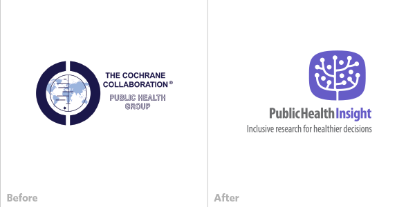
Client: research organisation
We created a new name for the Cochrane Public Health Group (a sub brand of the Cochrane Collaboration) based on their core offering: insights based on research. The position statement tells us that they conduct ‘inclusive research’, that is, research combining a wide range of methods, participants and contexts to form a better basis for decisions in public health. The logo symbolises the process of carefully selecting and distilling different kinds of data to generate insights.
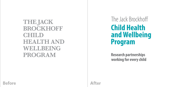
Brand change: new wordmark, new position statement
Client: research organisation funded by the Jack Brockhoff Foundation
Sometimes the name says it all and you might not need a symbol to convey what you do. The art of the wordmark is to create something distinct using just letters and colour. Using differences in size, weight and colour, our design breaks up the long name, creating a reading pause between the name of the funder and the name of the program without diminishing its importance. Health equity is the focus of the new position statement, playing on the notion of working in partnership and finding solutions to health problems that work for all children.

Brand change: new name, new logo, new descriptor
Client: peak body representing Victorian mental health carers and carers of people experiencing mental illness
Long organisational names are often shortened to make them easier to say and remember. A name has to balance the internal need to describe who you are and what you do with the need to give external audiences a handle to quickly and easily identify you. The name tandem is about people working alongside one another: to achieve more, to build mutual understanding and because they depend on each other. The logo symbolises ascent, progress and collaboration; vibrant colours and contemporary typography distinguish the organisation from peers in a sector where more conservative designs are the norm.
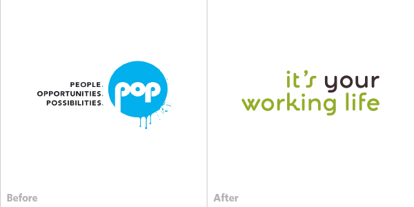
Brand change: new name, new wordmark
Client: Victorian local government
Our research into the perceived value of an internal brand for council staff showed that people wanted something more down to earth that had meaning for them. Rather than create a new logo that requires interpretation and tries to anticipate stylistic tastes, we crafted a wordmark that takes a clear position: you can take charge of your career.
Lorem ipsum dolor sit amet, consectetur adipiscing elit. Ut elit tellus, luctus nec ullamcorper mattis, pulvinar dapibus leo.
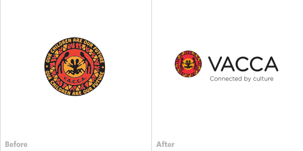
Brand change: refreshed logo, new position statement
Client: Aboriginal child protection organisation
The before is a classic example of a traditional grassroots logo, beautifully drawn, with everything neatly packed in a symmetrical badge. The trade-off is clarity and problems with legibility at small sizes. Research showed that staff loved their brand but wanted it to work better: they favoured renewal rather than retirement. We experimented with reducing the number of elements while retaining the central symbol of child protection. We replaced and resized the name and developed a new position statement focusing on culture as something that heals, and something that helps children form identity by connecting with family – past and present.
By Aaron Williams and Alan Fitzpatrick